After been given the task of taking picture on information kisok , i made some extra research on information kiosk and counter , and some other cool design..
well here are some of the pictures of the kiosk and counter that i find it interesting;
first thing that ran into y mind as i see this information counter is SIMPLE! the colours of the counter mainly consist of white which make it looks spacious. it also gives me the "relax" feel as i look at it. and for sure, i will approach and look around if i see this counter in my real life...
now this one looks elegant.. i assume it is placed in ax expensive shopping complex or something..the wood panel, the font and the colour scheme gives the professional look when i look at it.. the lighting seems just nice, not too much not too dark.. perfect!
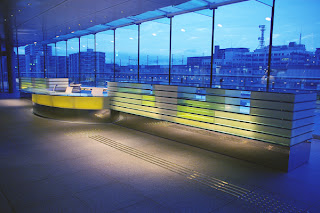
this information counter gives me a mood of "chill and relax" and i really feel like going into this picture.. what makes this information counter interesting is the glass behind it, you can enjoy the spectecular view outside.. usually, information counter just paste picture of beautiful and nice sceneries, but in this case, they use a real one!
as i googled information kiosk, this thing catches my eyes.. it look very modern and a lil futuristic. how cool if every shopping complex can replace the current information kiosk with this one :)
ok this will be a little different, but stil it is an information counter.. we usually can see this in other country mostly in europe and america.. why they have this tourist information? because they have a lot of tourist of course and this thing actually attract more and more tourist as they find it wouldn't be hard if they are traveling and got lost in the middle of the city. there's always tourist info!
question is, Malaysia also have a huge amount of tourist, why we don't see this in the middle of KL? urmm, governments' call..


No comments:
Post a Comment